Lighting and composition
Elhuyar Fundazioa
Going back to the first article of this section, the camera, unlike the eyes, does not distinguish what is visual and what is not important. For photography to have meaning, we must use the composition and lighting standards (and photographic techniques). The spoon is filled with the theme. And choosing the topic is giving importance to something differentiating from the things of the environment. To the techniques analyzed throughout the 14 chapters to date, we will add a composition more related to the artistic aspect and basic lighting standards that allow to obtain the best possible quality in our results.
Light direction
The basic elements of lighting are quality and direction. The direction changes the shape and shape of the object, highlights some surfaces and removes others.
The one that stands out most for its volume and texture is the transversal illumination; with the frontal illumination (rear of the camera) the texture and depth of the subject is reduced; the backlight accentuates the contrast, reduces the detail and eliminates the volumes, creates ziluetas; and the rest (midday sunlight) eliminates the volumes and creates very noticeable shadows under the eyes and nose in the portraits.
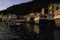
Time and time have a lot to do with the quality and direction of light. In color photography, above all, the influence of the position and height of sunlight on the subject is very important. Natural light changes throughout the day and year. The color temperature gradually increases with the height of the sun. Therefore, the light of sunrise and sunset is reddish; the light changes faster at both times. The films are adapted to the midday light.
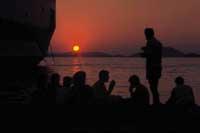
The direction of light also changes. In summer it forms a wider arch than in winter from the point of sunrise to the point of entry. Thus, in summer, especially at noon, the light is much more vertical and in winter the angle of light is more laid down.
Weather also influences, in temperate environments, due to the water vapor of the atmosphere, the light is usually more diffuse, which is especially noticeable in the hours of sunrise and sunset. The blue sky often generates blue shadows.
Light quality: strong light and strong light
It serves to set the lights, draw attention to something, change the shapes or reproduce the texture. Sometimes you can choose the most suitable light (for example, waiting for the most appropriate time), while on other occasions we will have to adapt to the one that there is and get the most out of it. In the study, on the contrary, lighting is controlled and used in one way or another depending on its purpose.
Strong light provides defined edges with strong shadows and produces results of contrasts and dramatic atmosphere. Ideal for articles with simple shapes, bright colors and smooth textures.
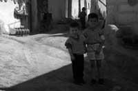
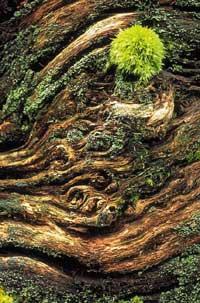
With the light of force the shadows are barely perceived (sometimes none), makes see the whole shape of the object and reduces the contrast between lights and shadows, creating a quieter environment (as can be seen in the photo of the child on the right). It is suitable for gaiconplicates (for which shadows can produce confusion) and for reproducing rough textures (such as the photo of the trunk).
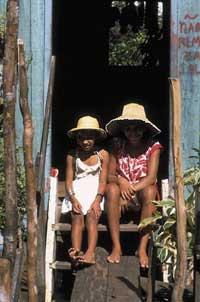
The quality of light is determined by the direction of the rays of the light source: the arrival of the rays in one direction (for example, the sun of the clean sky or a flash) produces a powerful light; if the light is dissipated (for example, reflecting it through the clouds or on some surface), the rays take different directions and it is the force.
Framing: approach
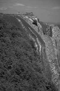
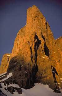
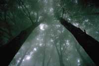
Most cameras have eye-level viewfinder and most often use this approach. However, changing perspective can get very interesting results. Photographs can be from top to bottom (photo of the forest), from bottom to top (from the mountain) or from close (photo of the girl and boy). Those from bottom to top are dramatic, as from below the size and feeling of strength increases. As the descending view leads the observer to look at the scene with superiority, the height of the objects decreases and often the feeling of tranquility predominates.
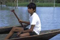
Distance change is also a useful resource. In order to obtain an internal view, for example, it is necessary to approach the object by filling with it the complete picture. This simplifies the image, leaving the subject out of the environment. Increasing the distance, we include the topic in the environment, that is, we relate it to other centers of minor interest. The distance allows to introduce elements that allow to highlight the perspective and the distance.
Frame: format
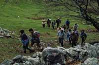
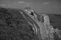
Photo formats can be both rectangular and square. The most widespread is the rectangle of 24x36 mm (35 mm format). Limited by this area, we have to decide where and how to cut it. There is the possibility of using this format horizontally or vertically, which, as can be seen in the examples, has a great influence on the composition. The horizontal format (or for landscapes) creates a sense of tranquility and space. The vertical (or portrait) reflects strength.
Composition: “rule of thirds”

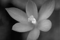
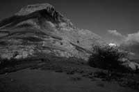
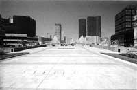
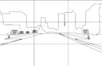
The arrangement of the elements of the figure, as well as the location of the main element in the picture, has a great influence on the compositional balance. Many photographers place the area of interest in a third of the picture, which can be seen in the three photos on the right (mountain, children and city). The “rule of thirds” allows to balance the elements of the image. This rule is very useful on many occasions and it is of great help to take it as a starting point, but that does not mean that we have to tie ourselves very well, because it has been conceived to break like all the rules. Even placing the object in the center can get good results (see photo of the flower).
Another way of setting or balancing the image (for example in landscapes) is by placing before the main object something that frames it (some tree, animal, rock or similar). In the image of Mount Anboto, the second from above, it was made by a bush located in the front right, specifically in the lower right third.
